OWA 2013 layout choice and optimizations for touch screens, tablets and smartphones
I have a laptop with a touch screen (actually, it is a Surface tablet) and also an iPad. When I use OWA on my iPad, it is optimized for touch input. For instance, some buttons are larger and there is an options bar at the bottom.
However, on my Surface, it always loads the mouse optimized version. This is true even when I detach the keyboard and use the Internet Explorer Modern App instead of the Desktop version.
Is there any way to get my Surface to load the touch optimized version of OWA as well?
 If your mail account is hosted on an Exchange 2013 server, Outlook Web App (OWA) can be set to 3 different layouts. OWA tries to recognize the device type and automatically selects the appropriate layout.
There are some situations in which you might want to overrule this selection. For instance, in the case of using a Surface tablet in Touch Mode.
Append the URL with a layout option
Switching between the 3 different layouts is hidden from the interface but can be done by appending a layout option to the base OWA URL.
- For most companies, the URL after logon will look something like this:
https://mail.domain.com/owa/#path=/mail - For Office 365 Exchange Online subscribers, the URL will look like this:
https://pod12345.outlook.com/owa/#path=/mail
Type one of the following parameters behind the /owa/ part to change the layout.
| ?layout=tnarrow | Single column layout optimized for small screens or when holding the tablet in portrait mode. This is the standard for recognized and supported smartphones. |
| ?layout=twide | Multi column layout optimized for larger touch screens or when holding the tablet in landscape mode. This is the standard for recognized and supported tablets. |
| ?layout=tmouse | Default layout optimized for mouse usage. This is the standard on normal desktops and devices with a supported browser. When the browser isn’t supported, OWA Light will be loaded instead. |

Office 365 URL for opening OWA in Touch Mode in the Internet Explorer App.
Extra tip: When you want to be able to easily switch between the layouts, add them all to your Favorites or Bookmarks of your browser with different names like; OWA Normal, OWA Touch and OWA Portrait.
App Bar, Dash Board and other options
Aside from larger touch areas and the changed layout, you’ll also get an App Bar at the bottom when using the tnarrow or twide layout.
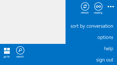
The App Bar bar gives you easy access to common functionality such as Search, Reading Mode and Refresh and for the tnarrow layout the ability to switch between folders.

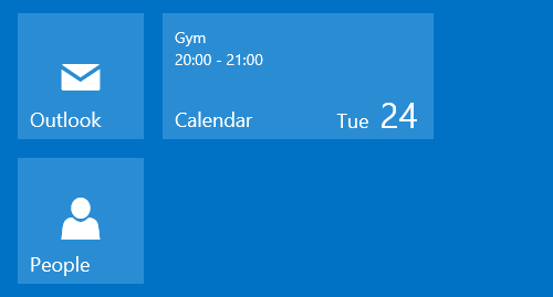
By using the “Go To” icon in the bottom left corner, you’ll open a dashboard to switch to your Calendar and Contacts folder. The Calendar tile even supports displaying upcoming appointments.

By pressing the triple points in the bottom right corner, you’ll see even more options and the ability to Sign Out.

Why use OWA instead of a Mail App with EAS support?
While you could of course also use the Mail app as an alternative (when EAS has been enabled for your), using OWA gives you additional benefits like accessing shared mailboxes, the Global Address List (GAL) and Public Folders.
Also, you may not want to configure your corporate email account on your “family” device or prevent corporate polices to apply to your device and then requiring you to enter a password to unlock (and risk a remote wipe with multiple failed logon attempts).

